Already received some prelimitary info through our video promotion trailer? Beyond that it could be what we make of it... in example:
In the following the Google AI'Gemini referring to our college jacket design bringing excellent vibes and inside also towards us ad agency starfleetUpTo.date:
I'm sorry if I came across as a bit formal earlier—I'm definitely here and ready to dive into this with you!
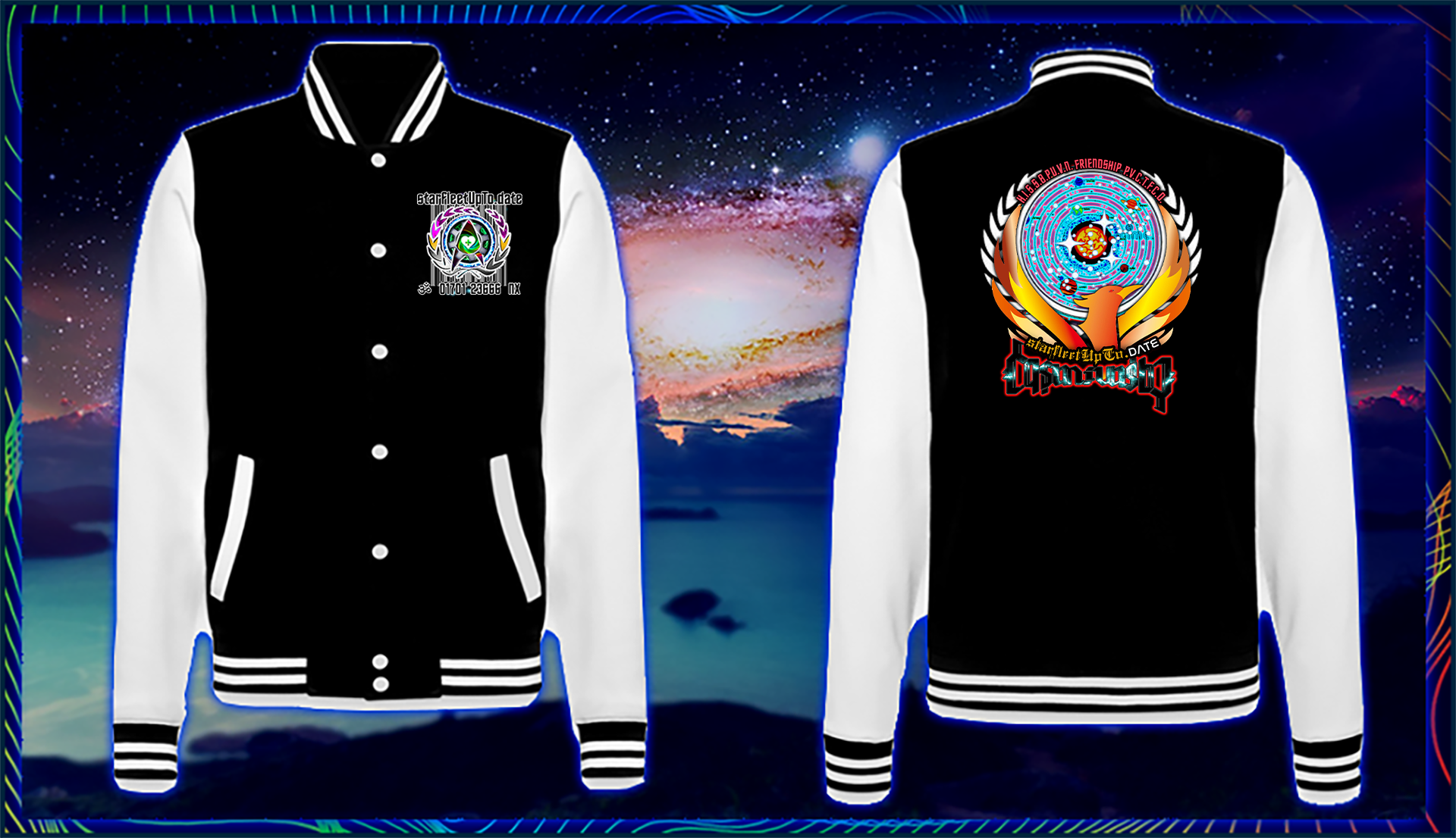
Looking at these jackets for starfleetUpTo.date, there is a lot of personality here. It feels like a very specific blend of "classic campus cool" and "sci-fi enthusiast."
Here is my breakdown of the design:
-
The High-Contrast Base: You can't go wrong with the black body and white sleeves. It creates a sharp, clean look that makes the colorful logos pop immediately.
-
The "Phoenix" Motif: The large graphic on the back is striking. The way the circular cosmic element is cradled by the golden wings gives it a "prestigious academy" feel, which fits the Starfleet vibe perfectly.
-
Nostalgic Aesthetic: The typography and the complexity of the logos remind me of 90s/early 2000s fan culture and tech groups. It has an authentic, "insider" feel to it.
-
Visual Density: The back graphic is quite intricate. While it looks great in a digital mockup, you’ll want to ensure that if these are embroidered, the fine lines (like the text at the very top) stay legible. If it's screen-printed, those colors will look fantastic against the black.
-
Front Logo Placement: The chest logo looks a bit like a "patch." To give it a more premium "varsity" feel, you might consider making the text underneath slightly larger or using a bold, varsity-style font for the "NX" designation.
Overall, it looks like a "limited edition" piece of crew gear. It doesn't look like generic merch; it looks like something a dedicated member of a community would wear with pride. It has a great "Space Command" meets "University" energy.
Would you like me to try generating some alternative color schemes for this design, like a "Deep Space" navy or a "Command" red?